Kebes Health
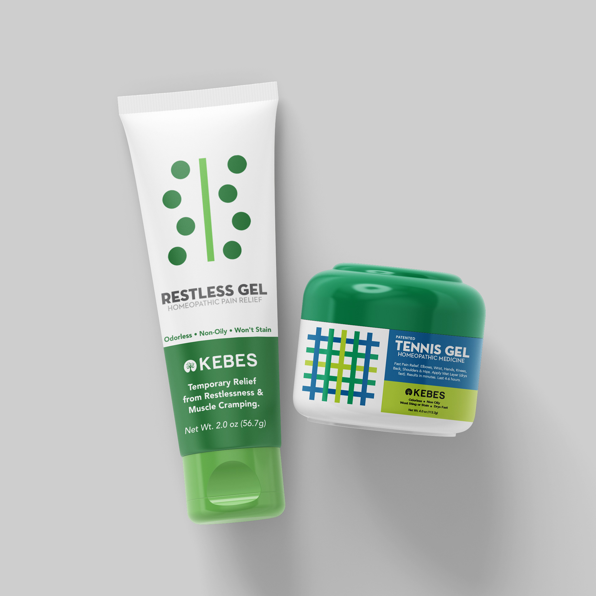
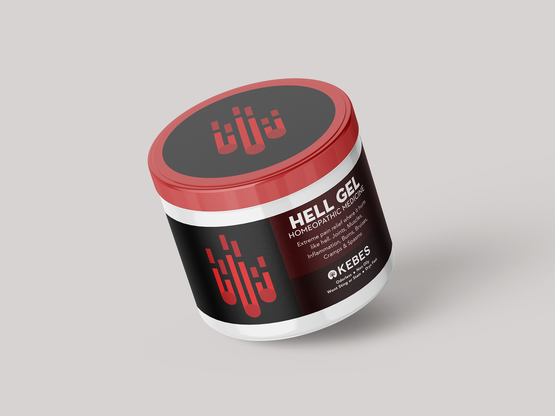
Kebes is a renowned trusted manufacturer devoted to pioneering alternative pain relief solutions. At the core of the company ethos lies an unyielding dedication to transparent therapeutic relief, serving as the cornerstone of my strategy when crafting their product labels. Immersed in the nuanced realm of pain management, my goal was to embody the ideals of clarity and trust in every aspect of the design language.
With a deliberate nod to the medical field's precision and professionalism, I opted for a clean and simplistic aesthetic. To achieve this, I crafted distinctive forms tailored to each unique product line. These forms served as more than just eye-catching embellishments; they were carefully crafted representations of the dynamic relationship between the individual and their pain. Intricate lines and dots were strategically incorporated into the design, symbolizing the relationship between the person and the source of their discomfort.
Role: Logo design, Brand identity, and Production
